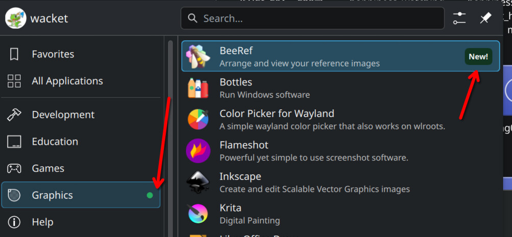
I cannot explain how much I do not want to see this green dot and “New!” text in my application launcher. Rather than be a passionate contributor like you, I have regrettably become a slave to the Big Tech industry - But one thing I can provide is insight into why operating systems like iOS and Windows have this noise: Impact driven development People need to justify their work on a continuous basis, with the upside of promotions and downside of layoffs. They add the most useless feature...

It’s more about which category a particular specific software belongs. If a kid installs an educational app/game that teaches programming by giving instructions to a turtle in order to draw a graphic/picture (I think I have seen something like that before). Which category should it be? games? education? development? graphics?
I personally don’t use this kind of menus with categories, I prefer dmenu style launchers where you type to search what you need. But if I was the kind of people that do use this kind of menus I would probably find that kind of indication useful.
You are right, the marker at the category level definitely makes sense to find the application initially.