

New GNOME dialog on the right:

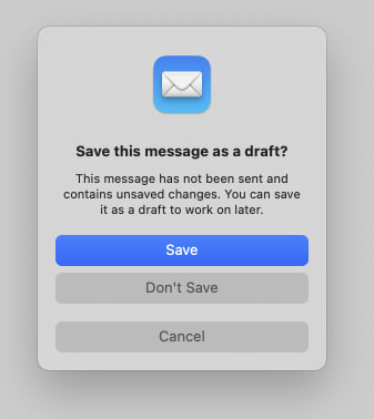
Apple’s dialog:
They say GNOME isn’t a copy of macOS but with time it has been getting really close. I don’t think this is a bad thing however they should just admit it and then put some real effort into cloning macOS instead of the crap they’re making right now.
Here’s the thing: Apple’s design you’ll find that they carefully included an extra margin between the “Don’t Save” and “Cancel” buttons. This avoid accidental clicks on the wrong button so that people don’t lose their work when they just want to click “Cancel”.
So much for the GNOME, vision and their expert usability team :P
As someone who tried out MacOS in a VM out of curiosity I don’t find gnome to be like MacOS at all in overall functionality. I think to most people it just looks like Mac because top bar, dock and some design choices. Really though gnome is much more like Android. MacOS felt extremely clunky to use vs gnome’s fluid workspace and app switching.
Top bar, dock, system settings, activities (somewhat e mix between Apple’s mission control and launchpad), now the modal buttons, accent colors… and so many other things.
Maybe you were running it without proper GPU acceleration and without a keyboard with actual macOS shortcuts on the function keys? Virtualizing macOS is hard and it will give you a very poor experience.
Obviously macOS has it’s defects but at least you aren’t risking losing your work due to a misclick nor you are restricted from having desktop icons like you’re on GNOME :)